Early 2018, I was requested to redesign the logo for 3XM Group. They wanted to vigorize the brand but keeping the essence that distinguish them in the market at the same time.
What I did
- Graphic Design.
- Brand consultancy.
The results
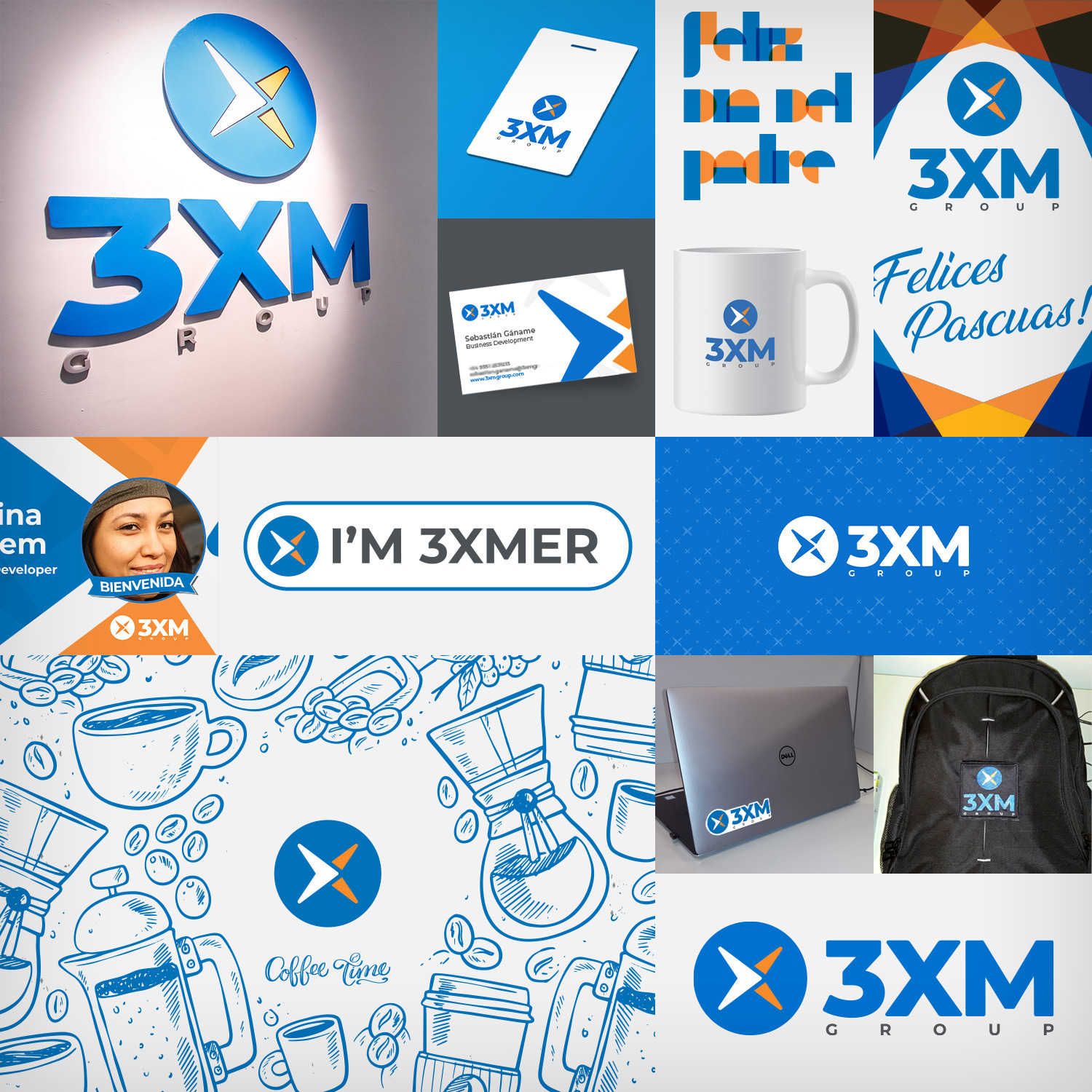
The customer were 100% satisfied with the results. The new design was utilized as the brand foundation to kick off a lot of visual changes within the company, i.e. office design, cards, merchandise, bags, notepads, digital assets such as emails, flyers, etc.
Old logo analysis
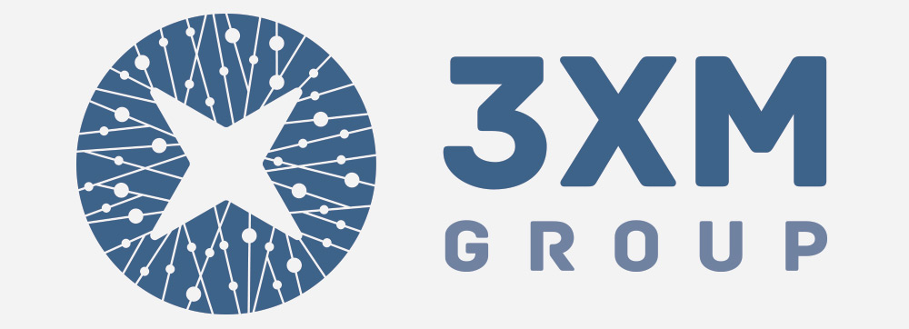
- Muted colors.
- Too serious and formal.
- Complex shapes, hard to reproduce in small formats.
- Isotype too big compared with text.
- The word "GROUP" should be less prominent.
New logo proposal
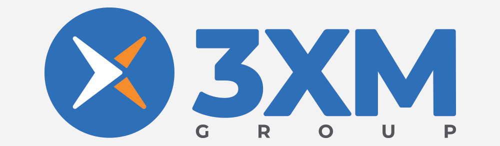
- Maintain the original essence.
- Vibrant colors.
- Flat and modern look and feel.
- Orange as a secondary color, adds dynamism to the brand.
- Colors and new shapes emphasize the idea of an always moving forward company. Pushing for the future.
- Isotype simplified, easy to reproduce.
- At some point, the word GROUP will be removed. I proposed them to have an iterative process in which, the word "group" becomes smaller. In future revisions will be easier to delete it completely without impacting to the brand recognition.
- Most importantly, the brand has been renewed and still be acknowledged by the current customers.