Mauro Imán Senior Product Designer
 

Prologue


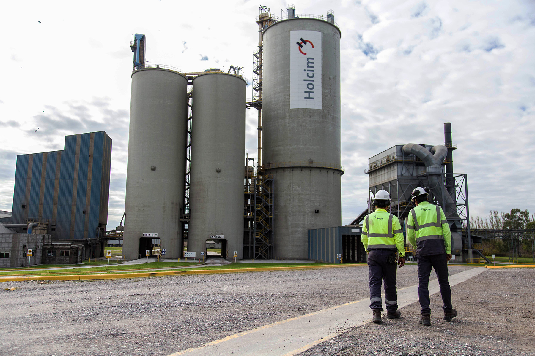
Back in 2018, I had the opportunity to work on a project for the multinational company Lafarge Holcim. The group I worked with was composed by Ignacio Garribia (InfoValue), who performed the role of Project Owner and Manager. Dario Vigano (Head of Labor Relations Holcim Argentina), the customer. And my self, Mauro Iman, the UI/UX Designer.

More people were involved occasionally during the project, however this was the group I shared most of the time.

The project

The scope of the project was geographically delimited to Argentina (first phase). The long term strategy is to gradually deploy the solution to a wider audience (other countries).

The customer required a solution to manage human resources effectively in a large scale corporation with hundreds of employees.

The company had implemented different solutions in the past, the most recent and important one is Mi Llave, a self-management system the personel can interact through different channels in order to perform their requests.

The process

The goal of this section, is to tell the story behind the process I gone through. It will give you a better idea the way I work.

Problem definition

The first step was let the customer describe the requirements, the expectations, the problems found on previous experiences.

We detected a common issue, which is the complexity of self-mnagement by collaborators (employees).

The HR department performes most of the requests received by email, or in person, individually. With hundreds of people working and submitting requests every day, it becomes time consuming and a not efficient process. This was the main vector that pushes Holcim to look for a new and modern solution.

We also discussed over the existing solutions, currently there is a mix of channels in order to conduct a variety of HR activities. The most relevant is Mi Llave, this tool was aimed to assist collaborators to self-manage their needs, however after a thorough analisis, we found a list of possible reasons of why it is not performing as expected:

  • Distributed Kiosks over the facilities were not user friendly.
  • These kiosks were computers (like totems) that sometimes lack of maintenance, so they were not 100% operatives.
  • Just a few terminals were available for hundreds of employees (bottle neck).
  • The password was hard to remember.
  • The workflow to reset a password was too complex.
  • People tend to skip using kiosks due to frustration, and instead use an informal channel to process their needs.
  • HR communications and initiatives were not communicated effectively at large scale.
  • Engagement were too low.

Finally but not the least, the customer required to keep the new solution as more dynamic as possible, in other words, the content should generated by different means, these are:

  • HR initiatives, news.
  • Autogenerated content based on the staff information and third parties.
  • Generated by collaborators.

User Personas

As part of this initial process, two type of users personas were identified: Collaborators (Operators) and Supervisors. However, a third role were discovered during the usability tests, Coordinator.

Collaborator (Operators).
  • Works in the plant or building.
  • Moves frequently around the facilities.
  • Some of them are truck drivers
  • Work environment has multiple challenges. Weather conditions, Dirty, Noisy.
  • 70% Male 30% Female
  • Age range from 18 to 60
  • Wears safety equipment.
  • They manage only personal information.
Supervisor (Supervises a group of collaborators)
  • Works in the HQ Building.
  • Ocasionally, moves to the plant to manage different situations.
  • Work environment is dynamic and organized.
  • 50% Male 50% Female
  • Age range from 25 to 50
  • Wears comfortable clothing
  • They manage their personal info.
  • They also manage the collaborators information under their responsibility.
Coordinator
  • Have the faculty to perform actions on behalf of other collaborator.
  • This role is in between the Collaborators and Supervisors.
  • An example would be the Nursery's personnel.
Collaborators walking in Holcim plant

Measure Success

Once the problem were deeply analyzed, we wrote a list of user stories in the backlog. However, we still had pending the definition of a criteria to measure success. In order to do this we reviewed the notes taken from the previous discussions and determined the most important KPIs required to measure the success at the end of the project. These are:

Engagement
  • Current state: Poor. People only use the service when they must. They tend to avoid interactions with kiosks.
  • Goal: Enhance the experience by proposing different activities, tools and quality content. A metric of success is to encourage the usage after business hours (at home).

Time of usage
  • Current state: Minimal. The staff tend to use the application only once a mont to review the payment receipt or make a request. They don't find other activities in which they can spend more time..
  • Goal: Increase the time of usage by automating and making easier different tasks required by the employee. This will release the pressure over the HR department to assist on every request. Every employee should be self autonomous to perform most of the activities.

Satisfaction
  • Current state: Neutral. The employee struggle to find what they need as a result, they frustrate and search for other channels to drive their requests. Services are fragmented in different applications.
  • Goal: Organize and centralize the services and information under one single solution so it is easy to use and accesible by employees.

Scalability
  • Current state: Difficult. The employee required a computer or access to a kiosk that actually works. The news and communication are fragmented. This is important, because an important portion of the staff is not aware of different HR initiatives that were communicated in different mediums (web applications as well as cork boards spread in common areas of facilities).
  • Goal: HR efforts should be simplified and strengthened to easily reach all the audience.

Once the requirements were documented, goals and expectations set, I started wireframing a mobile application. The reasons why I choosed this path are:

  • It is cost effective.
  • Every collaborator has a smartphone.
  • Hassle free.
  • Communications and initiatives can be distributed near realtime (push notifications).
  • Easy to scale or evolve in the future.

Information Architecture

After a few iterations, we reviewed the initial wireframes and defined the Information Architecture, which is laid out in 6 key areas:

Social Stream

Birthdays, aniversaries, recogniztions, promotions, welcome new people, etc

HR Self-management

Mi Llave integration. From here collaborators will perform their requests.

Benefits

Gifts, days off, access to the list of benefits from the loyalty program.

Entertainment

Games. Would be nice to reinforce safety compliance through entertainment.

Messages

A simple chat to encourage collaborators keep their talking fluid.

Profile Management

Personal Data, CV, addresses, picture. Everything from the file record.

This is a quick tour over the prototype


Usability Tests proposal

Goals

For testing the prototypes, I worked with the customer a list of goals in order to measure success as well as to validate the proposed designs:

  • Completion of tasks rate.
  • Workflow efficiency.
  • Identify issues and successes of the proposed design.
  • Finding out the purpose of the application perceived from the user perspective.

Methods

Initially, we agreed to have individual interviews with the employees and potential candidates that are likely to use the application. The interview, were composed by the following items:

  • Interview with open and closed questions.
  • Prototype testing.
  • User Observation.
  • Each session will be recorded on video for further insights.

Users

Due to some constraints, I was not in position to test the designs across the entire staff. Instead, we selected a 10% sample of the staff. The criteria of selection included the following parameters:

  • Percentage of Male/Female candidates should be similar to the overall percentage.
  • Candidates should be from all ages. (the range of age vary from 20 to 60).
  • Candidates should be from factory (operators) as well as from the administrative areas.

This criteria allowed me to have a curated list of candidates to test the product. The outcomes can be extrapolated with more precision.

Tasks performance

During each session, I asked the candidates to perform different tasks and excercises. The instruction was direct and one at the time.

  • Visualize the last paycheck.
  • View healthcare tips and recommendation.
  • Find personal info and change the address.
  • View personal CV.
  • Download a labour certificate.
  • Send a message to work colleague.
  • Plan the date for your next holidays.
  • Request a salary advance.
  • Request support from the HR department.
  • Visualize the status of your current inquiries.
  • Request a Force majeure certificate.

Was the task completed or not? How long the task took from the request till the completion? Information like this was captured and analyzed in order to validate the proposal.

Open-ended and close-ended questions

This poll is basically a guideline to help the user to express different thoughts. During the interview, each question triggers other questions and directions which I explored along with the candidate. Some of the questions are:

  • Likes
  • Dislikes
  • What are the main tasks? Name three.
  • Do you use other Holcim applications? Name them.
  • How likely is to use the new app outside the working hours?
  • What section is expendable? (nice to have but not a must).
  • Suggestions, comments.

Environment

We defined two different labs to run the sessions. The first one was in Malagueño’s Factory, were operators develop their daily work.

The second lab, was established in the Holcim HQ located in Cordoba. Here is were the employees associated with the administrative departments develop their work.

In both labs, the conditions were to have a separated room, only for testing purposes. No distractions and the candidates will come one at the time.

I took my gear with me in order to have a minimal but descent testing enviroment and capturing everything on video for further insights. The elements I used were:

  • Notepad and pen.
  • Camera mounted on a tripod.
  • Voice recorder (like journalist).
  • Laptop.
  • Phone.
  • Tablet.
  • Cables, extra batteries and charger.

When the candidate walked into the room, the first thing I did was to have a small talk with them, the goal was to break the ice and make them feel comfortable. Some of them were more shy than others, I just triggered small conversations and let them talk most of the time. Also I asked for their consent to record the session, the footage will be private only for my analysis.

Once the confidence was good enough, I asked the candidates to naturally grab the phone so I can adjust the camera on the tripod to point where the action happen, the device’s screen and hands.

In addition to this, I used a software to record the screen on the phone.

Once the setup was ready, I started by asking to execute the first task.

Testing results overview

Fig. 1 - Tasks Trials Performance
Fig. 2 - More Requested Tasks
Fig. 3 - Interests in having "Bolsitas" Loyalty Program built in app
Fig. 4 - How likely would users use this app after work?
Fig. 5 - Navigation Preferences
Fig. 6 - Holcim Internal apps usage
previous arrownext arrow
Slider

Fig. 1 - Tasks Performance

This table is the summary for tasks performance. Each column correspond a task. Each row corresponds to a user.

In order to simplify the scoring, I defined a scale of 3 values:

0 The task was not completed.
5 The task was completed, but there were minor challenges.
10 The task was completed successfully.

At the bottom of the table, the totals represent the overall performance for each task. Higher is better.

Fig. 2 - More Requested Tasks

One the the goals were to find out what are the more requested tasks and features. The three more important ones are related to paycheck, holidays and benefits.

Fig. 3 - Bolsitas Loyalty program insights

The company has a reward program called Bolsitas, it is a catalogue of benefits and products that can be traded with points. We leverage this oportunity to find out how if the users would like to have it integrated with the app. 70% of the users said yes. With this discovery, we decided to include it in the next version of this mobile app.

Fig. 4 - Utilizing the app after work

90% of the users said they are likely to use the application after work.

Fig. 5 - Navigation Preferences

When observed the users interacting with the prototype, I noticed that 50% of them prefer to use the OS buttons to go back. The other half touched the arrow in the title bar to go back to the previous screen.

Fig. 6 - Holcim Apps usage

Holcim has a wide variety of solutions deployed in the organization, some of them are more popular than others. Each solution provides specific features and access to different level of information.

The goal with this question is to explore the platforms that are more frequently used the collaborators, this way we can extend the research to more specific areas and potentially add more value to our prototype.

Findings from usability tests

  • Single credentials to access the entire digital ecosystem of the company. This will encourage employees to access and consume information from the HR department. I recommend the File record ID, which is the easiest to remember by the operators.
  • Initially, we defined two roles, Colaborator and Supervisor. However, under specific circunstances, there are some areas that needs to perform actions on behalf of other users, i.e. Nursery. This is the reason why we need a third role wihin the application, Coordinator.
  • The IT department must verify every user’s status (Active or Inactive). There are some cases in which an active user attempts to log in, but the system blocks him because the records says is otherwise.
  • Holcim has an internal phone number in order to provide support (CREST). However, the findings showed that none of the candidates have ever used such service. Multiple causes: 1) It is unknown, never heard of it. 2) People that know it, complains about its efficiency, so they gave up in using it. 3) They prefer to contact someone directly or send an email. The faster way.
  • Users asked for the ability to view reports and results like the Health Care revision or check from the last 12 months. Also the ability to schedule an appointment in order to plan this medical routine.
  • The expendable section is Games. Nice to have, but not a must.
  • A potential friction to deploy this solution, is the resistance to install an application from the company in personal phones.
  • Benefits gained a lot more of visibility and importance. Users look first the following section: Equilibrium, Plus and latter but not the least, Health.

Proposed Enhancements

  • Increase font and icons size in order to be more friendly with older users.
  • Add option to specify the type of material.
  • Add option to download or print approved material orders. (this way they can have a receipt in paper or PDF to present to engineers).
  • Thumbnails in main screen are not intuitive. Style and design need to be reviewed in order to make obvious that you can tap them for additional interaction.
  • Under the section Mi Llave, some users requested to have a kind of favorites or shortcuts to the more recurrent actions.
  • When tap the profile picture, display personal info.
  • Personal info, cards order: Personal Info, Personal Data, Digital Record File, CV.
  • Remove next paycheck date, everybody knows this information. It is always the same day every month.
  • In the chat section, if you tap collaborator’s thumbnail, you will see the contact information (phone, email).

Final stage

We left out many ideas out of the scope because it would jeopardize the deadlines we agreed upon the beginning. However, these ideas and enhancements were added to a new backlog for phase 2 in order to keep them under the radar.

Regarding phase 1, it was completed on time, tested and documented in Confluence.

The deliverables and documents extents to the following topics:

  • Prototype
  • Design Specs
  • Grid System, Layout
  • Hand gestures and interactions
  • Functionalities, Weather API, News, Birthday, Recogniztions, Aniversaries, etc
  • Roles differences (collaborator, supervisor)
  • Game definition: Rules, Questions, Answers, Scoring system.
  • Chat interactions
  • UI Components kit
  • Icons
  • Images
  • Fonts
  • Tone for messages
  • Map Navigation (hierarchy of screens)

Development is still on hold until a new budget is discussed and approved. Nevertheless, I truly enjoyed working on this project, and I firmly believe that it will success when it becomes a reality.

Back to Portfolio

Mauro Imán

Mauro Imán

Contact me: mauro.iman@sensatica.com